Talent infusion
AI design system
Design System
AI-Enhanced Process
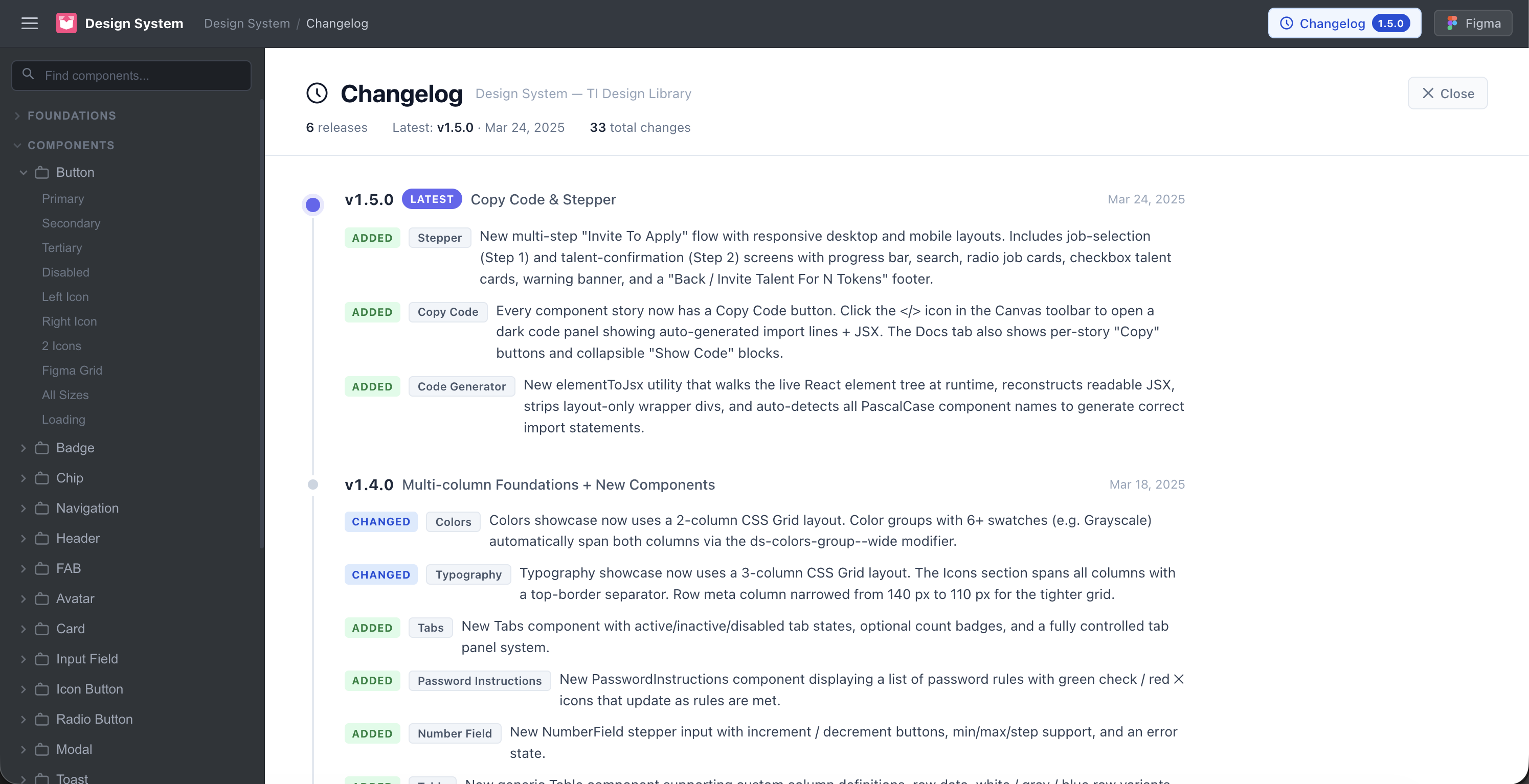
From Stagnant Library to Living System
How I used AI tooling to transition a fragmented component library into a scalable, accessible, and developer-ready design system using Figma and Cursor
year
2025
Company
Talent Infusion
Role
Lead Product Designer
Project Duration
4 Sprints
After
Before
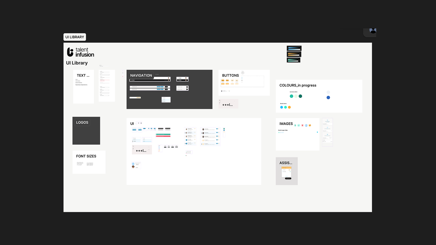
The initial transition from the artboard/library to a more organized file/component structure.
Context
The Design Library Was A Liability
Before joining the team, the company had hired a third-party resource to create the reusable components for the app; however, it didn't account for general accessibility, was disconnected from production code, relied on undocumented rationale, and had no consistent token structure. While the developers were using these components to build, there was a gradual drift between design and engineering in each sprint.
One of my first design efforts within the organization was to resolve the systemic gap: starting at the basics by refactoring the library, then using that as a foundation to architect a design system that engineering could actually own and build from.
Considering that this was a brand new Saas product from its parent company Blavity, The challenge wasn't the components themselves. It was creating a shared language and a workflow that would be sustainable across a very lean design team, tools, and time.
No design tokens — spacing, color, and type were hardcoded everywhere
Accessibility was reviewed reactively, after builds.
Documentation was non-existent
Components existed in Figma but had no corresponding code equivalents, which added to development implementation estimates.
workflow
An efficient two-tool pipeline
After retrofitting the existing component in the library to ensure the best possible output, I designed a new workflow that treated AI as a collaborator at every stage, from initial token structure in Figma using best practices through to production-ready React components in Cursor.
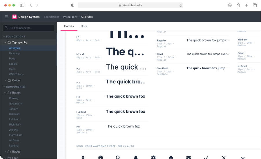
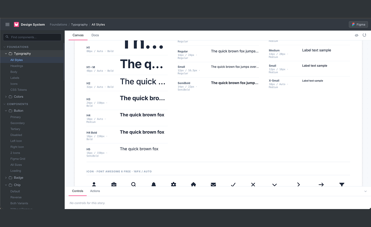
Audit & Restructure the Library
Used Figma's variables and component properties to establish a token-first structure, mapping every color, spacing, and type decision to a named, semantic variable.
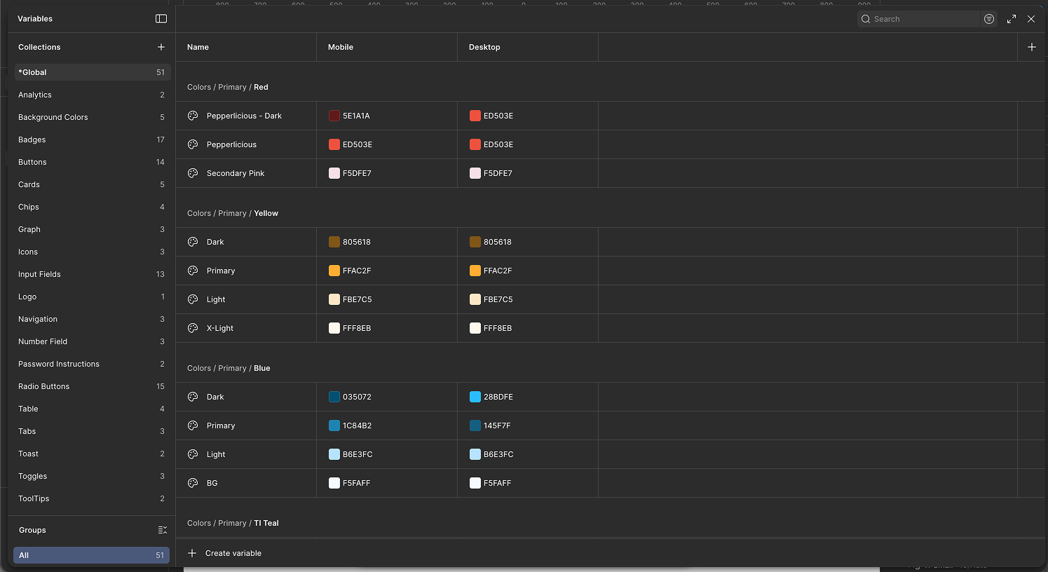
Transitioning the initial design library into functional variables.
Created a full component audit matrix — naming, variants, states, usage context (when needed)
Established component token hierarchy (deviating slightly from the primitive - semantic method for more control when possible)
Used AI prompting in Figma plugins to surface and remedy naming inconsistencies
From Static Design to React Code
Used Cursor with a custom .cursorrules file to convert Figma components into production-ready and reusable React components.
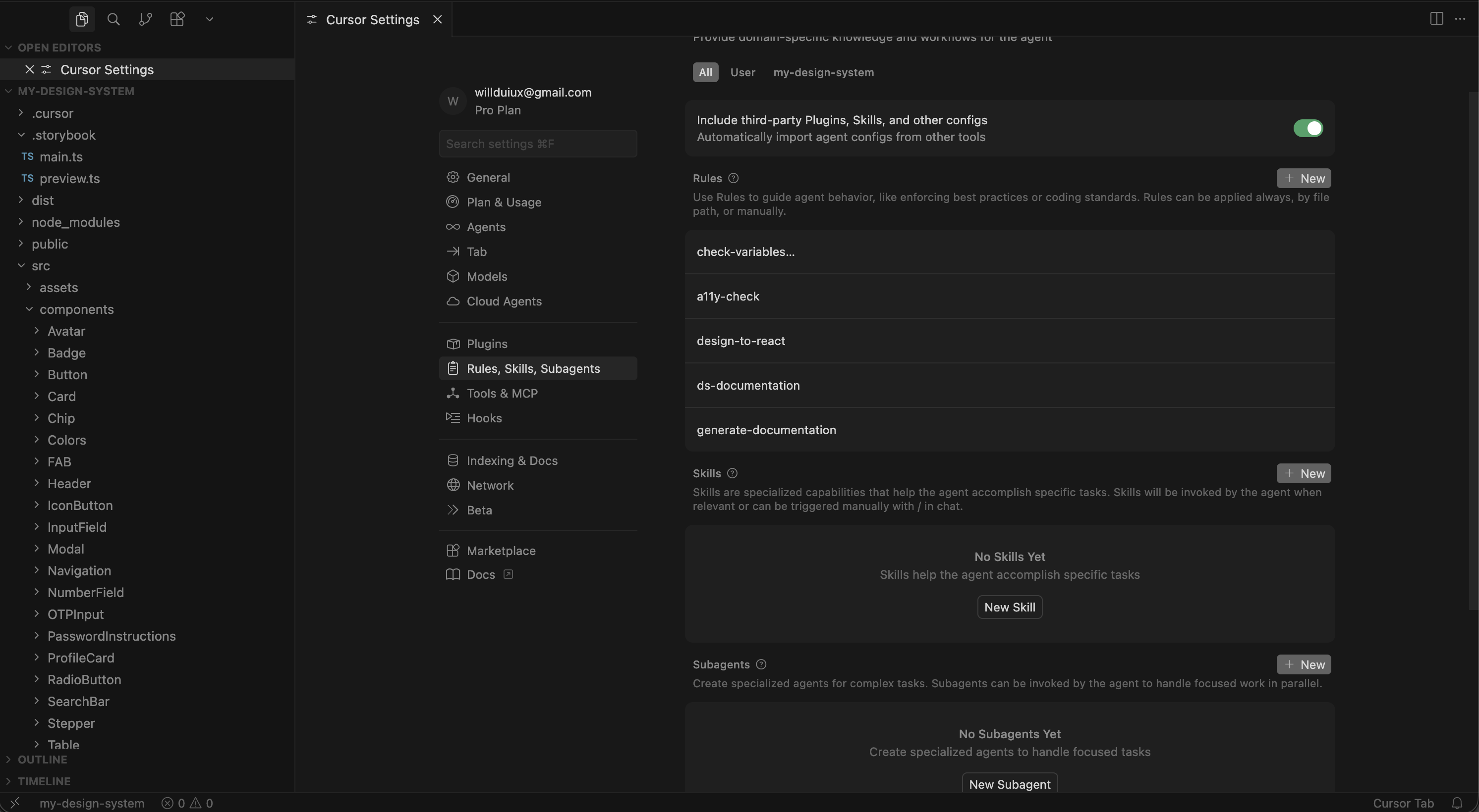
Cursor rules used to ensure the output of the design system remains consistent and compliant with both internal and A11Y guidelines
Rules enforced token usage — no hardcoded values in generated code
Every component generated with TypeScript props and JSDoc documentation
Storybook stories auto-generated alongside each component
Rules prompted for ARIA and focus management on every generation
Accessibility-First Guardrails
Built accessibility checking directly into the workflow loop — not as a phase, but as a constraint at both design and code generation stages.
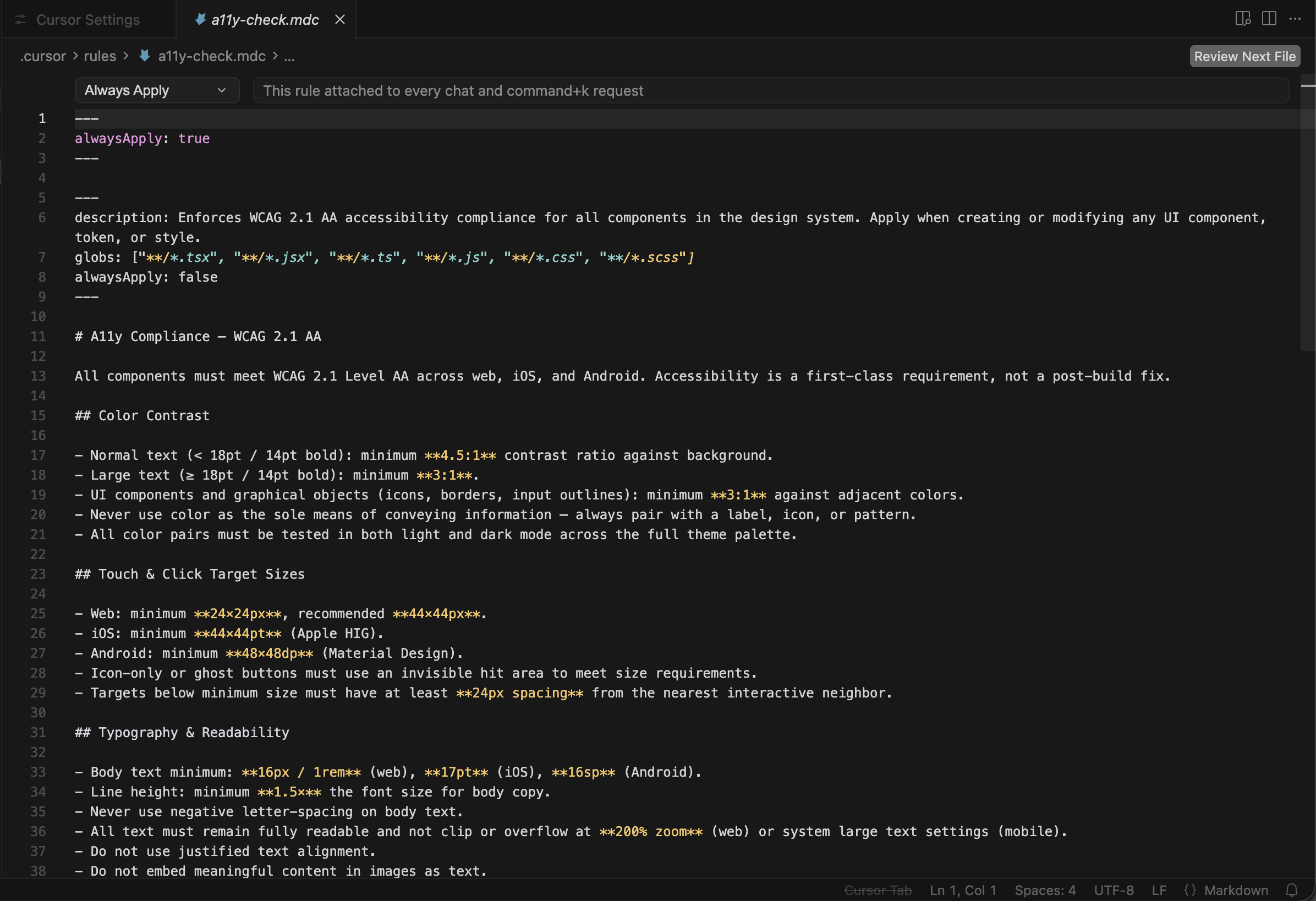
A11y cursor rules
Figma annotations layer flagged contrast, touch targets, and focus order
Cursor rules included WCAG AA checklist validation on every component
AI generated a plain-text a11y summary per component for QA handoff
Documentation & Feedback Loops
Cursor rules auto-generated structured documentation and changelog entries, creating a feedback loop between design decisions and stakeholder visibility.
Cursor-generated changelog featured within the storybook output
Markdown docs generated per component: usage, props, do/don't, a11y notes
Changelog prompts captured intent behind every decision — not just what changed
Weekly system-health summaries generated for stakeholder review
New patterns flagged for mandatory human review before merge
Transition
Getting Components Pixel-Perfect
The most persistent friction in this workflow wasn't generating components but the gap between how a component looked in Figma and how it rendered in code. The same component, two tools, two different outputs. These are the four categories where drift happened, and exactly how each was resolved.
Category 1
Figma variable names didn't match code token names (Token Mismatch)
Challenge
A component in Storybook rendered with the wrong color or fell back to a default. The token was defined in code, the variable was defined in Figma but they used different naming conventions. Figma used color/primary/colorname, the token file used color.colornamePrimary.
Solution
Added a naming convention section to .cursorrules that specified the exact token import path and format with real examples. Also created a shared naming reference doc — one column for Figma variable names, one for the equivalent code token — that both designers and engineers kept open during handoff.
Category 2
Pixel values differed between Figma and the browser (Spacing + Sizing)
Challenge
The Components looked slightly off when translating them into code. Padding felt tighter, or an icon sat a pixel too low. Inspecting in Figma showed sizing like 14.5px; the browser rendered 14px since sub-pixel values in Figma have no equivalent in CSS unless you use decimal rems — and those compound across nested components. Also taking into consideration text line height when figuring spacing for text within a component.
Solution
Audited all spacing tokens and snapped them to a 4px base grid. Any Figma values not on the grid were corrected in Figma and not worked around in code. Added a Cursor rule requiring spacing to reference grid-aligned tokens only. After the audit, sub-pixel drift disappeared completely.
Category 3
Figma had states the component didn't, and vice versa (Missing States)
Challenge
The Storybook Playground showed a component without a crucial state. Figma had one designed. In another case, the engineer had added an error state during build that was never in Figma — it existed in code but nowhere in the design source. Reviewers caught issues inconsistently depending on who was looking.
Solution
Added a states inventory step to the process: before generating, I documented the complete list of states in the figma file for devs to crosscheck/reference. The list goes into the Cursor prompt explicitly in the form of a screenshot with adequate labels to eliminate any potential guessing. The .cursorrules file was updated to require a Storybook story for every named state.
Category 4
Type looked different in Figma and in the browser (Typography Rendering)
Challenge
Text in Figma appeared slightly crisper and more tightly spaced than in Storybook. Line heights that looked right in Figma felt slightly loose in the browser. In some cases, a label that fit on one line in Figma wrapped to two lines in the component — breaking layouts that depended on fixed heights.
Solution
Three changes: set -webkit-font-smoothing: antialiased globally to match Figma's default rendering. Audited all line-height tokens and expressed them as unitless multipliers (1.5) rather than fixed pixel values — these scale correctly with font size. And added a Storybook story specifically for long-label overflow on every text-bearing component, catching wrap issues before they reached review.
Results
Measurable outcomes,
shared wins
The goal was never just a cleaner Figma file. The system had to reduce friction for everyone — designers, engineers, PMs, and stakeholders.
~3×
Hand-Off Speed
98%
WCAG AA Compliance
30%
Reduced Design Reviews
50+
Tokenized components
100%
Component Conversion
1 week
Dev Onboarding time
Post-Release
Reflection
Rules over prompts
While performing brainstorming sessions, the team leveraged the usage of prompts to generate ideas, but for the design system creation, it was more appropriate to create rules within cursor as it allowed us to retain focus on a centralized goal even with diverse perspectives.
Accessibility has to be structural and prominent
Building accessibility into generation rules meant the team never shipped a component without knowing its a11y compliant. This also changed the focus from it being an afterthought (discussed before shipping) to something that was considered naturally cross-functionally throughout the entire process.
Documentation is a design artifact
When documentation is auto-generated from the design process itself in multiple formats, it stops being a burden and allows collaborators across disciplines to understand the project’s progress (in this case, the design system).
The designer's role expands, not shrinks
AI handled generation and documentation, which freed me to focus on system architecture, stakeholder alignment, and decisions that require judgment — not just execution. This also allowed those with more limited exposure to design to think beyond the concepts of “look and feel”